Below are accepted variations of the logo for alternative media and design requirements (such as one-colour printing, where full colour is not possible, or for dark backgrounds).
You can also customise the name written below the logo, to replace the word “INTERNATIONAL”, with the name of your field (eg. “UNITED KINGDOM”, “FRANCE”), or the name of the department or commercial name (eg. “BOOKSHOPS” or “BOOKS FOR THE WORLD”). The text format (small caps or all caps) is to be decided at the time of creation according to the particular requirements. Please see the “Unacceptable usage” for guidelines of how NOT to use the logo and the text underneath.
Accepted variations of the main logo
It has been agreed that, in certain limited circumstances, the logo may be ‘deconstructed’. This is permitted as follows:
-
On websites, specifically where a responsive layout limits the amount of space available for the logo on mobile devices
-
On CLC Publications where the space available does not permit the use of the full logo on the spine of the book
Where the logo is ‘deconstructed’ the following variations are permitted:
-
The book image with ‘CLC’ either side by side or arranged vertically
-
The book image with ‘CLC’ either side by side or arranged vertically with the CLC country name under ‘CLC’
Simplified version with book symbol and the 'CLC' word only
Due to the slant in the book graphic, the alignment of the book and the word 'CLC' should be visual, rather than exact. Exact alignment makes the ensemble appear de-centered.
his means that the top of the book graphic is slightly higher than the top of the word 'CLC'.
For horizontal alignment, the bottom book 'spine' should be on top of the letter 'L' in the word 'CLC'.

Vertical simplified logo with name of country below
Due to the variation in length of country names, this must also be visually assessed and perhaps not use this version if the name of the country is too long (longer than 10 letters) that it would make the words hard to read. A general guideline would be that the height of the country name should not exceed one third of the height of the CLC word and not be shorter than one quarter.
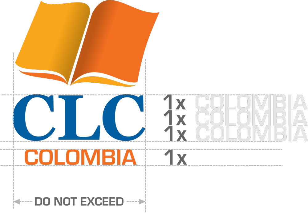
Horizontally, the name of the country underneath should also NOT exceed the width of the CLC word.
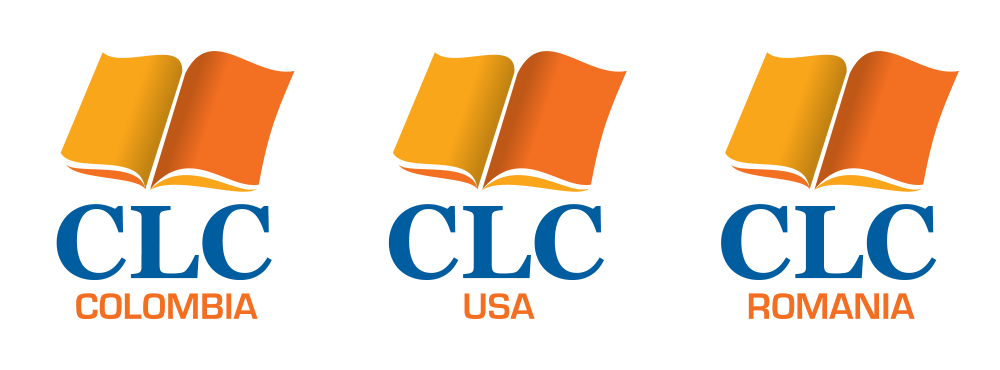
In the example below, the 'Papua New Guinea' version would NOT be acceptable, because it is too long and then letters are too small.
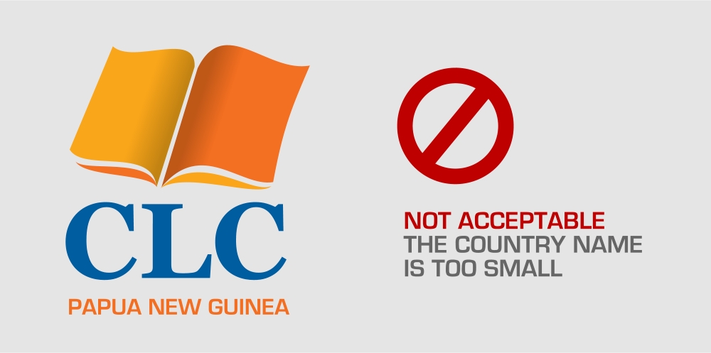
Simplified version with reduced height for the word 'CLC'
In this variation, the word 'CLC' is reduced in size to make room for the name of the country below, while staying within the vertical confines of the book symbol. The same rules apply as above, where the name of the country should not exceed the width of the CLC word, as well as more than one third of its height.
If the name of the country/department is shorter than the word CLC, it should be aligned to the LEFT (as in the example of Chile).
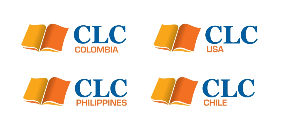
It is NOT acceptable to use the words on two lines, thus going outside of the height of the book (as is the example of Papua New Guinea below):

In the case of Papupa New Guinea and other countries with longer names, it is acceptable to put the name below the whole logo, underneath the book symbol, as below. In this case, the word CLC should be made the same height as the book symbol.
Again, the name of the country should now NOT exceed the width of the entire design.

Logo variations for publishing
Particularly for use on the spine of books - which may vary greatly in thickness - the following logo variation should be used, over a white background at the base of the spine, with two coloured bars as shown:
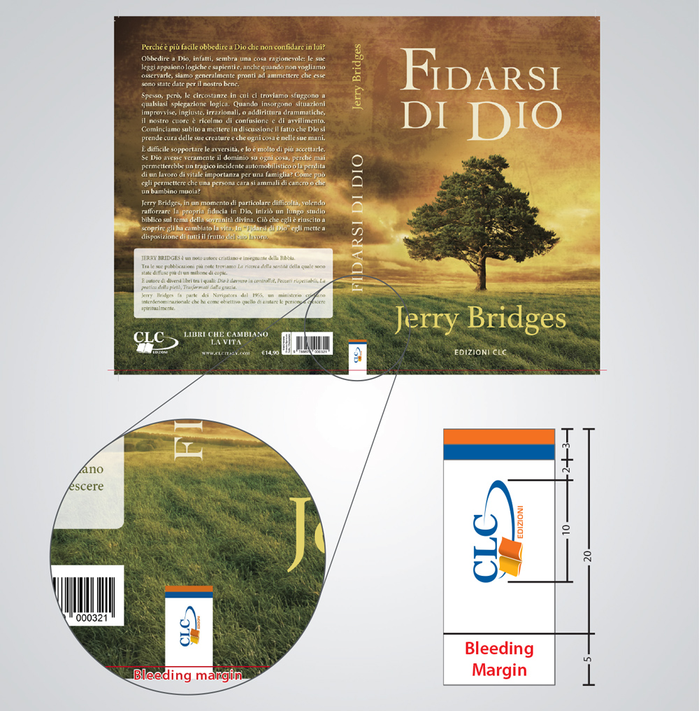
The logo on the book spine can be rotated to fit any local standards and should go the same direction as the text on the spine (Top-To-Bottom or Bottom-To-Top).
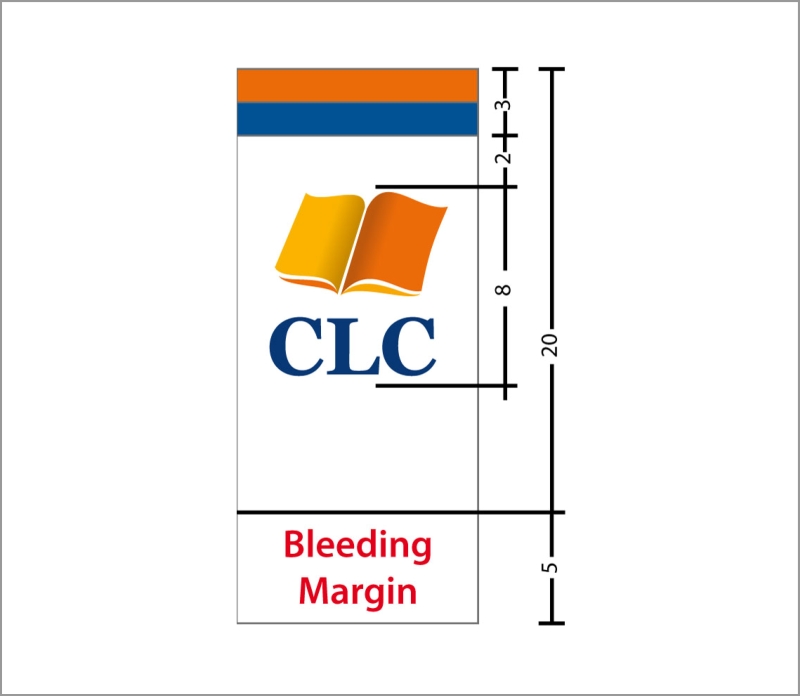
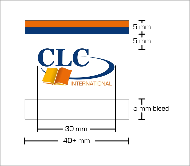
Depending on the book spine, and to prevent contradicting the unacceptable use of the logo turned 90 degrees, the following variation for publishing is also acceptable:
For a typical narrow book (1-2 cm thick):
For a wider book (3-4 cm thick or more):
Please note:
CLC Media Services will provide on-demand source files for any of your needs. Please refer to section 5 for details on how to download these files.